Input Button
입력 필드 형태의 버튼으로, 선택창이나 피커를 열 때 사용합니다. 선택이 완료되면 버튼 라벨에 선택된 값이 표시됩니다.
Field
Input Button을 Field 내부에서 사용하여 Select Field로 활용할 수 있습니다.
Anatomy
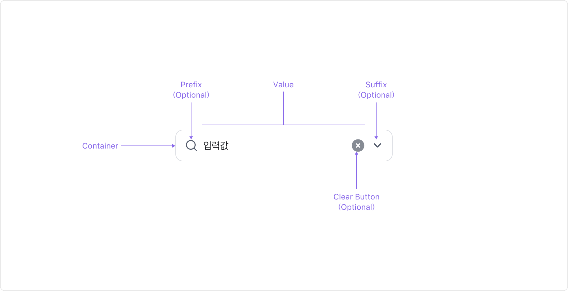
Input Button은 Value, 이를 감싸는 Container, Clear Button (Optional), 그리고 Prefix/Suffix Slot으로 구성됩니다.
Properties
State
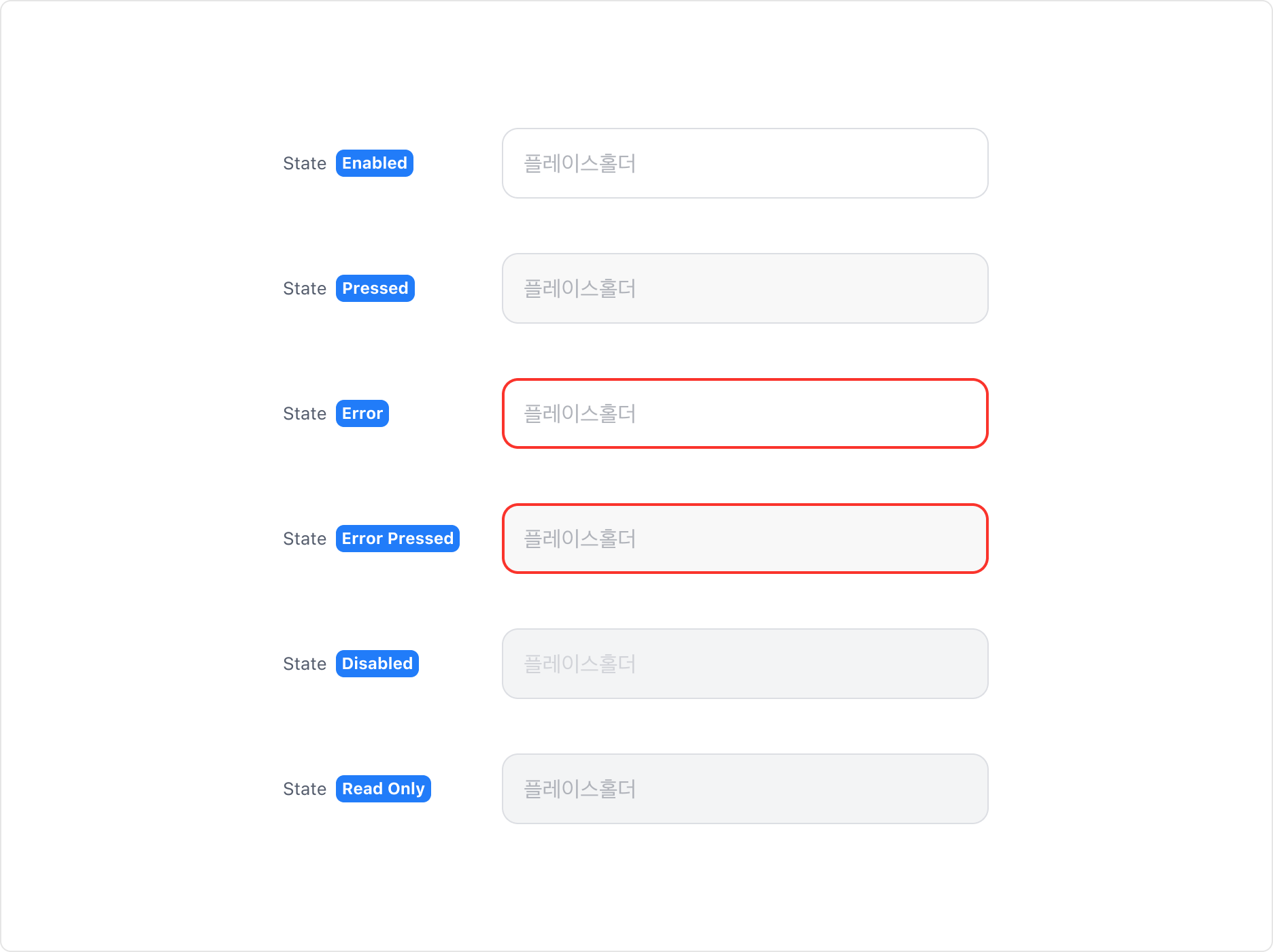
Input Button은 Enabled, Pressed, Error, Error Pressed, Disabled, Read Only 상태를 가집니다.
Value Property
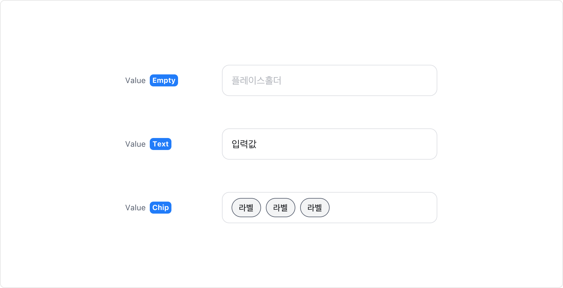
Input Button에 값이 있는 경우 Value Property를 사용할 수 있습니다. Value에는 일반 텍스트와 Chip 컴포넌트를 표시할 수 있습니다.
Clear Button Property
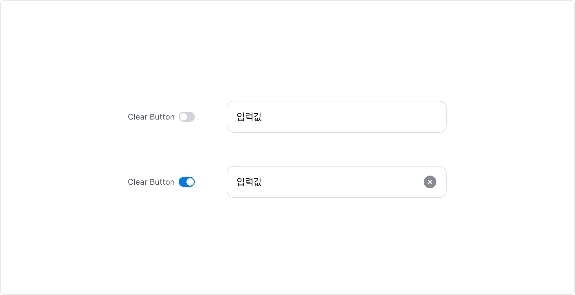
Input Button에 값이 존재하는 경우, 해당 값을 삭제할 수 있는 Clear Button을 표시할 수 있습니다.
Guidelines
Input Button의 활용
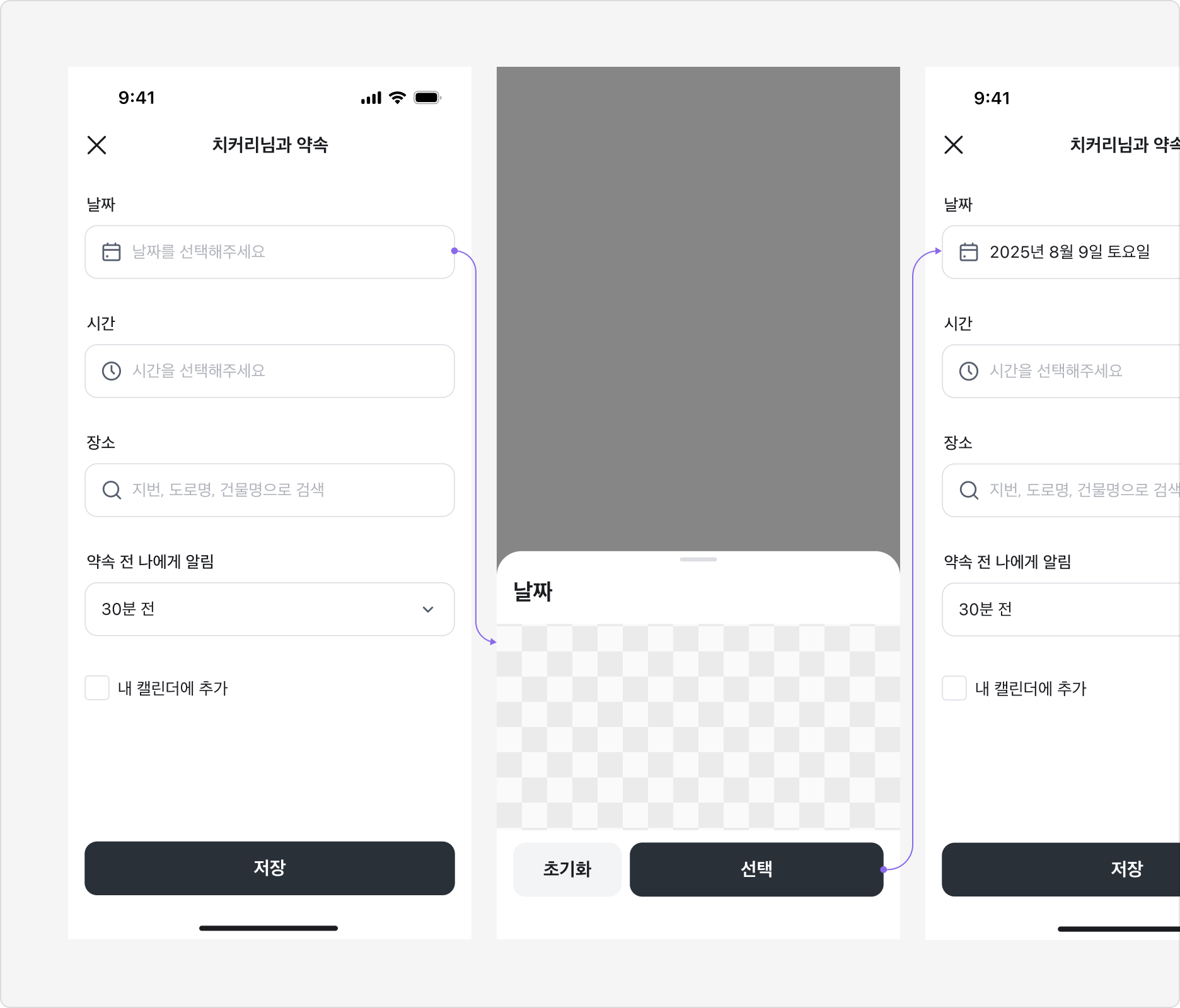
Input Button은 Input과 유사한 외형이지만 직접 값을 입력할 수 없는 버튼 컴포넌트입니다. 선택하면 Bottom Sheet나 Picker 등이 열려 값을 선택할 수 있으며, 선택이 완료되면 버튼 라벨에 해당 값이 표시됩니다.
Input Button은 단독으로 사용할 수 없으며, 항상 Bottom Sheet, Date/Time Picker 등 선택 가능한 아이템 목록을 제공하는 UI 요소와 함께 사용해야 합니다.
Specification
base
| 상태 | 슬롯 | 속성 | 값 |
|---|---|---|---|
| enabled | root | height | |
| cornerRadius | |||
| gap | |||
| paddingX | |||
| strokeWidth | 1px | ||
| strokeColor | |||
| color | |||
| colorDuration | |||
| colorTimingFunction | |||
| strokeColorDuration | |||
| strokeColorTimingFunction | |||
| strokeWidthDuration | |||
| strokeWidthTimingFunction | |||
| value | fontSize | ||
| lineHeight | |||
| fontWeight | |||
| color | |||
| placeholder | fontSize | ||
| lineHeight | |||
| fontWeight | |||
| color | |||
| prefixText | fontSize | ||
| lineHeight | |||
| fontWeight | |||
| color | |||
| prefixIcon | size | ||
| color | |||
| suffixText | fontSize | ||
| lineHeight | |||
| fontWeight | |||
| color | |||
| suffixIcon | size | ||
| color | |||
| clearButton | size | 22px | |
| color | |||
| pressed | root | color | |
| invalid | root | strokeWidth | 2px |
| strokeColor | |||
| disabled | root | color | |
| value | color | ||
| placeholder | color | ||
| readonly | root | color | |
| value | color | ||
| placeholder | color |
Last updated on