Components

Attachment Input

사진, 영상, 파일 첨부를 다루는 입력으로, 선택, 업로드, 진행률, 실패, 삭제 상태를 관리합니다.
FigmaReact
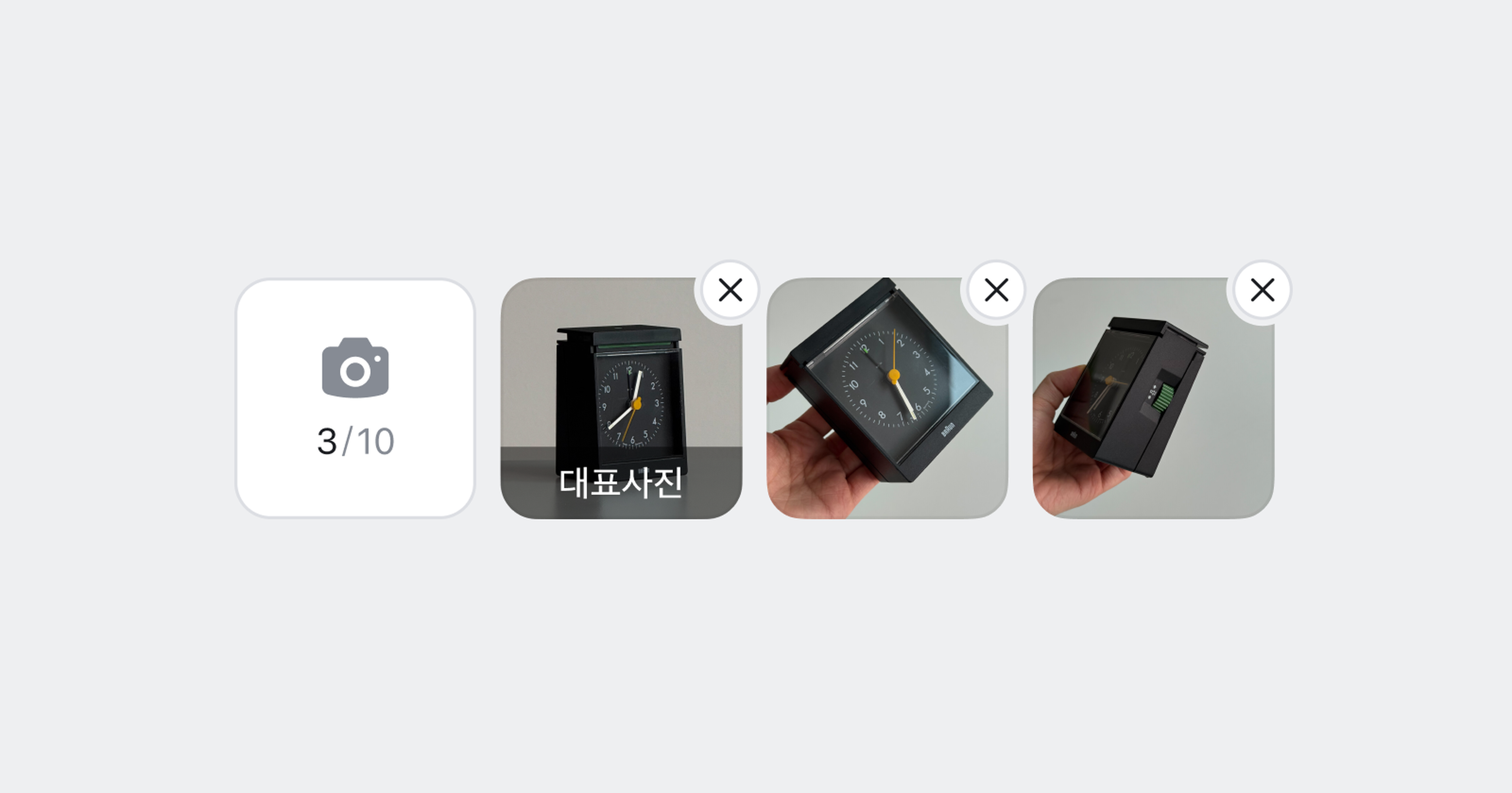
Attachment Input cover image

Anatomy

Attachment Input은 Trigger와 Preview로 구성되며, Preview에는 항목에 대한 액션(삭제/재시도)과 업로드 진행 상태를 표시할 수 있습니다.
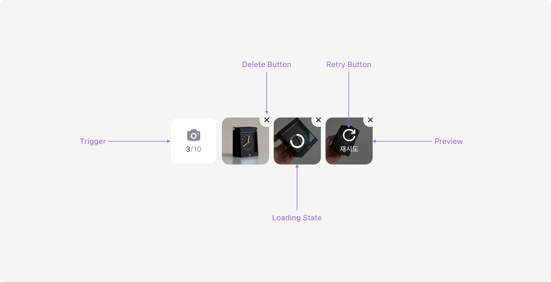
Attachment Input의 Anatomy 이미지. Trigger, Delete Button, Preview, Loading State, Retry Button으로 구성됩니다.

Properties

Variant

Attachment Input은 사진/영상을 첨부하는 Media 타입과 파일을 첨부하는 File 타입으로 구성되어 있습니다.
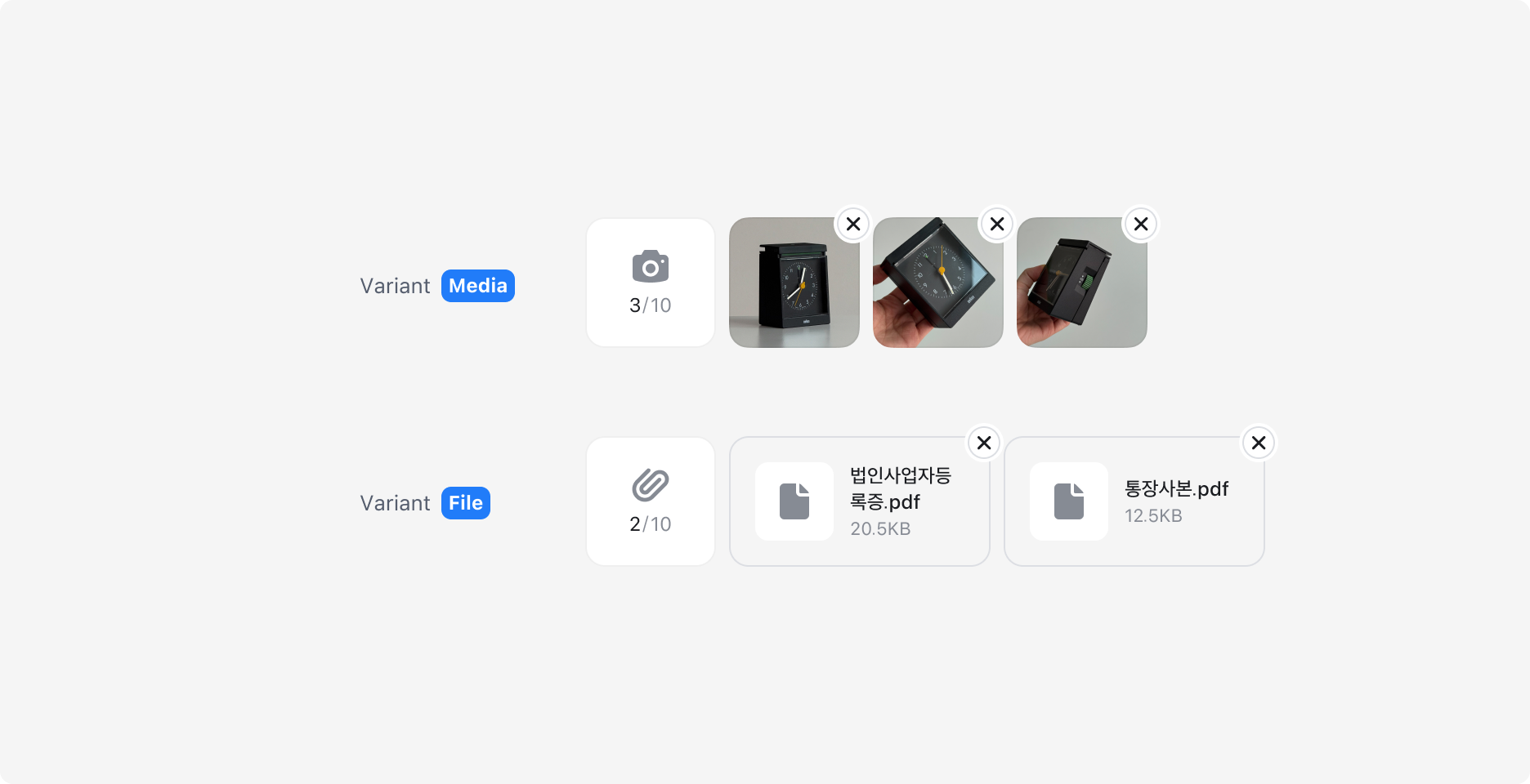
Attachment Input의 Variant - Media, File

Preview Badge

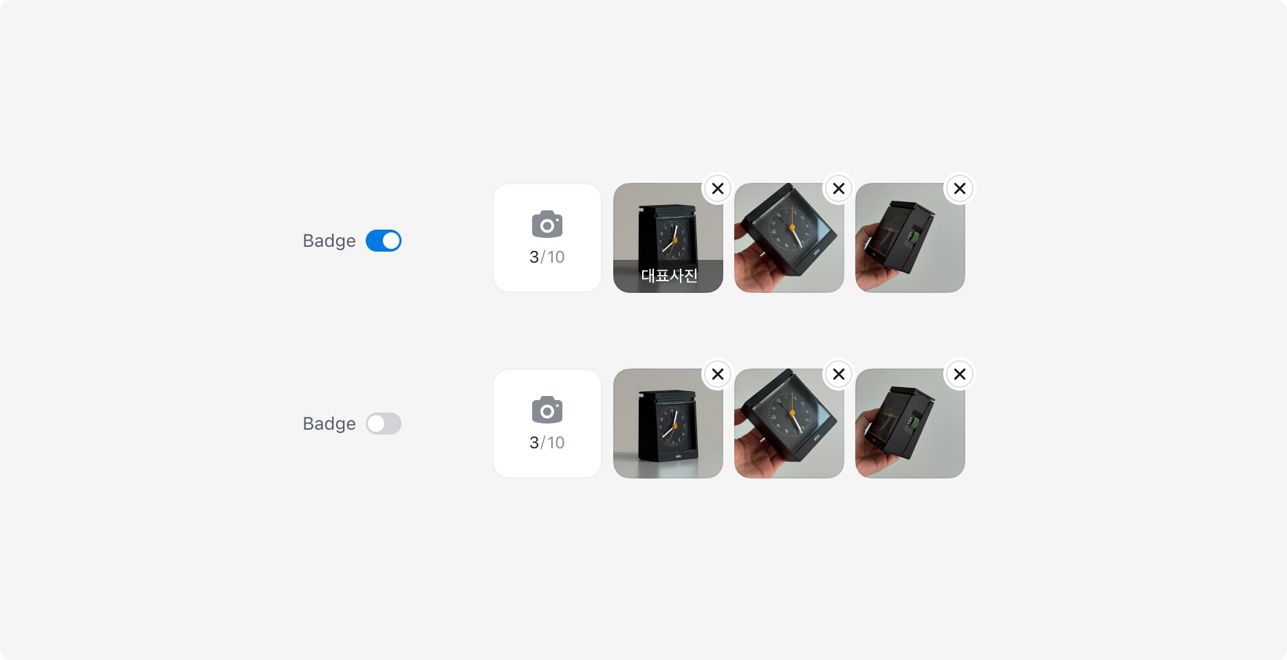
Preview 항목에 배지를 표시할 수 있습니다. 주로 첫 번째 Preview에 대표사진 배지를 표시하는 용도로 사용합니다.

  • 배지는 썸네일 하단에 반투명 오버레이 형태로 표시됩니다.
  • 배지 레이블은 변경할 수 있습니다.

Attachment Input Preview Badge 예시

State

Trigger와 Preview는 각각 다른 상태를 가집니다.

  • Trigger: Enabled, Pressed, Disabled 상태가 있으며 값이 있는 경우 Count는 Neutral 컬러로 표시됩니다.
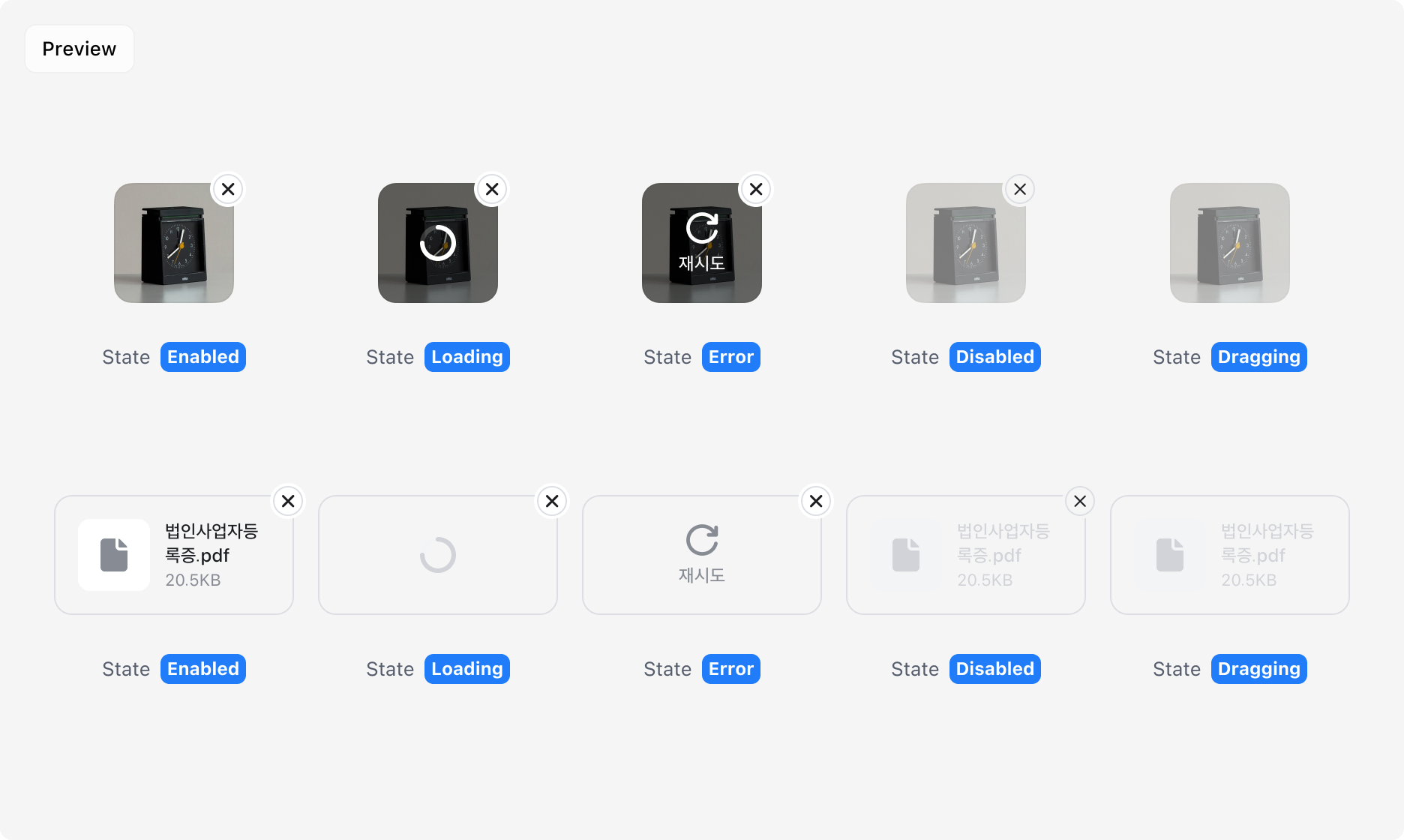
  • Preview: Enabled, Loading, Error, Disabled 상태를 가집니다.
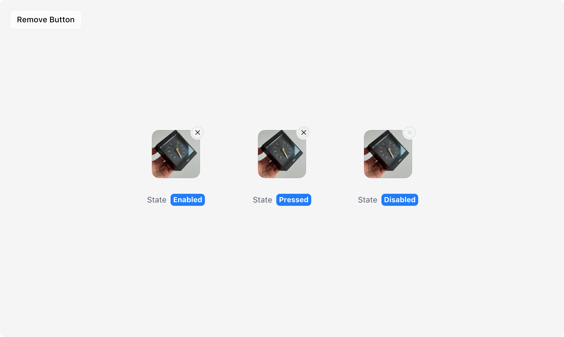
  • Remove Button: Preview 우측 상단의 삭제 버튼으로, Enabled, Pressed, Disabled 상태를 개별로 가집니다.
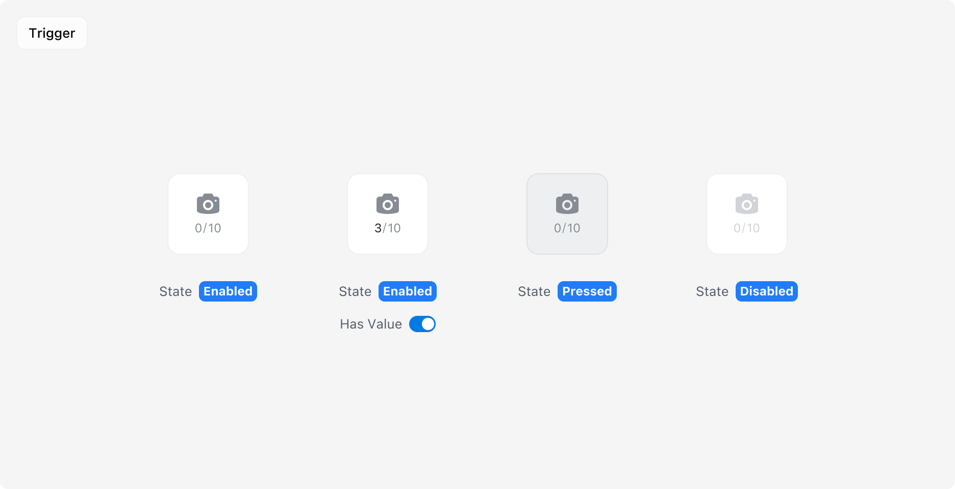
Attachment Input Trigger의 Enabled, Has Value, Pressed, Disabled 상태 예시

Attachment Input Preview의 Enabled, Loading, Error, Disabled, Dragging 상태 예시

Attachment Input Remove Button의 Enabled, Pressed, Disabled 상태 예시

Dropzone

파일을 드래그 앤 드롭으로 업로드할 수 있는 영역입니다. 기존 Trigger 버튼과 함께 사용되며, 드롭 가능한 영역을 시각적으로 명확히 제공합니다.

  • 버튼 클릭과 드래그 앤 드롭 두 가지 방식으로 파일을 선택할 수 있습니다.
  • 드래그 진입 시 영역 테두리와 배경색이 변경되어 활성 상태를 표시합니다.
  • 파일 선택 후 Preview가 Dropzone 하단에 인라인으로 표시됩니다.
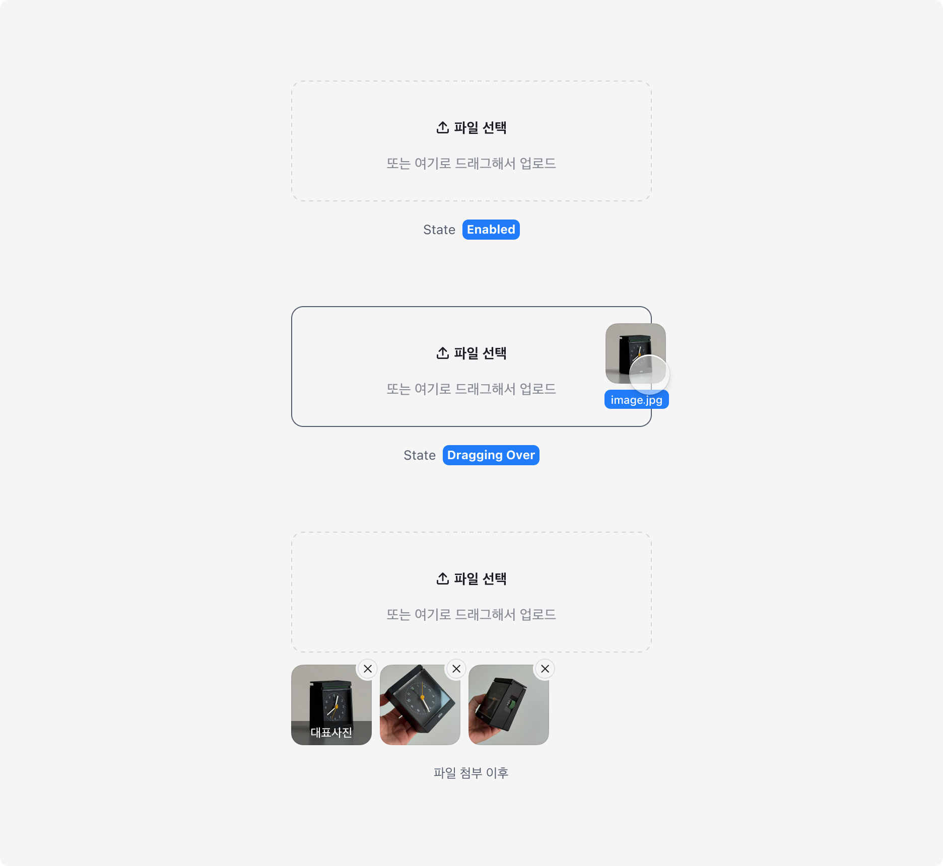
Attachment Input Dropzone의 Enabled, Dragging Over, 파일 첨부 이후 예시

Reorder

Reorderable 옵션을 활성화하면 Preview 항목을 드래그하여 순서를 변경할 수 있습니다.
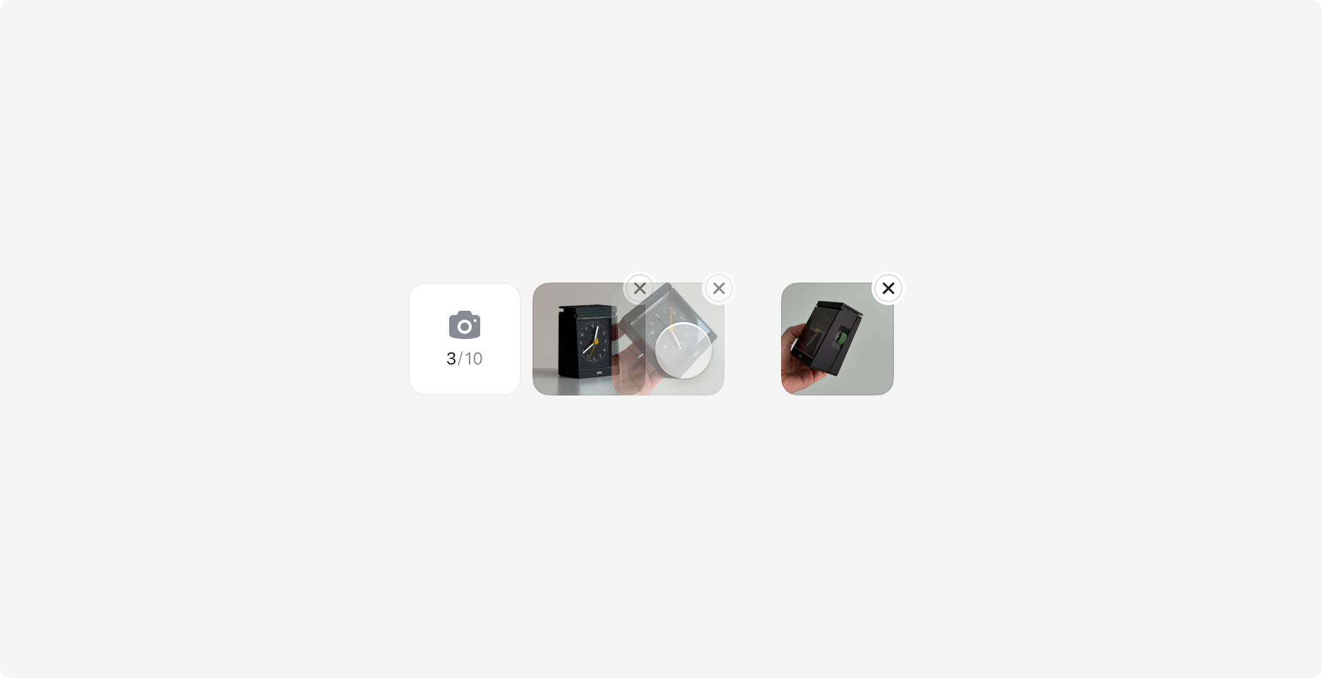
Attachment Input의 Reorder 예시

Specification

Attachment Input

base

상태슬롯속성
enabledrootgap
itemsgap

Attachment Input Trigger

base

상태슬롯속성
enabledrootsize
gap
color
cornerRadius
strokeWidth
strokeColor
iconsize
color
itemCountcolor
fontWeight
fontSize
lineHeight
maxItemCountcolor
fontWeight
fontSize
lineHeight
pressedrootcolor
disablediconcolor
itemCountcolor
maxItemCountcolor

Attachment Input Item

base

상태슬롯속성
enabledrootheight
color
cornerRadius
strokeWidth
gap
thumbnailcolor
size
cornerRadius
thumbnailIconcolor
size
namecolor
fontSize
lineHeight
fontWeight
sizecolor
fontSize
lineHeight
fontWeight
removeButtonMaskoffset
size

type=file

상태슬롯속성
enabledrootwidth
strokeColor
paddingX
readonlythumbnailIconcolor
namecolor
sizecolor
draggingthumbnailIconcolor
namecolor
sizecolor

type=image

상태슬롯속성
enabledrootwidth
strokeColor
backdropcolor
badgecolor
height
cornerRadius
paddingX
badgeLabelcolor
fontSize
lineHeight
fontWeight
readonlyrootopacity
draggingrootopacity

Attachment Input Item Action Button

base

상태슬롯속성
enabledrootgap
iconsize
labelfontSize
lineHeight
fontWeight

type=file

상태슬롯속성
enablediconcolor
labelcolor

type=image

상태슬롯속성
enablediconcolor
labelcolor

Attachment Input Item Remove Button

base

상태슬롯속성
enabledrootsize
cornerRadius
color
strokeWidth
strokeColor
offset
iconsize
color
pressedrootcolor
disablediconcolor

Attachment Input Dropzone

base

상태슬롯속성
enabledrootheight
gap
paddingX
cornerRadius
strokeWidth
strokeColor
labelcolor
fontSize
lineHeight
fontWeight
draggingOverrootstrokeColor
disabledlabelcolor

Last updated on

On this page