App Screen
Stackflow 네비게이션에서 개별 화면을 구성하는 컴포넌트입니다. 모바일 앱과 같은 화면 전환 경험을 제공할 때 사용됩니다.
import { IconBellFill } from "@karrotmarket/react-monochrome-icon";
import { Flex } from "@seed-design/react";
import type { StaticActivityComponentType } from "@stackflow/react/future";
import {
  AppBar,
  AppBarCloseButton,
  AppBarIconButton,
  AppBarLeft,
  AppBarMain,
  AppBarRight,
} from "seed-design/ui/app-bar";
import { AppScreen, AppScreenContent } from "seed-design/ui/app-screen";

declare module "@stackflow/config" {
  interface Register {
    ActivityAppScreenPreview: {};
  }
}

const ActivityAppScreenPreview: StaticActivityComponentType<"ActivityAppScreenPreview"> = () => {
  return (
    <AppScreen theme="cupertino">
      <AppBar>
        <AppBarLeft>
          <AppBarCloseButton />
        </AppBarLeft>
        <AppBarMain>Preview</AppBarMain>
        <AppBarRight>
          <AppBarIconButton aria-label="Notification">
            <IconBellFill />
          </AppBarIconButton>
        </AppBarRight>
      </AppBar>
      <AppScreenContent>
        <Flex height="full" justify="center" align="center">
          Preview
        </Flex>
      </AppScreenContent>
    </AppScreen>
  );
};

export default ActivityAppScreenPreview;
Installation
npx @seed-design/cli@latest add ui:app-screenUsage
import {
  AppBar,
  AppBarBackButton,
  AppBarCloseButton,
  AppBarIconButton,
  AppBarLeft,
  AppBarMain,
  AppBarRight,
} from "seed-design/ui/app-bar";
import { AppScreen, AppScreenContent } from "seed-design/ui/app-screen";<AppScreen theme="cupertino">
<AppBar>
<AppBarLeft>
<AppBarBackButton />
</AppBarLeft>
<AppBarMain>Title</AppBarMain>
<AppBarRight>{/* actions */}</AppBarRight>
</AppBar>
<AppScreenContent>{/* content */}</AppScreenContent>
</AppScreen>Props
App Screen
AppScreen
Prop
Type
preventSwipeBack?boolean | undefinedonSwipeBackStart?(() => void) | undefinedonSwipeBackMove?((props: { displacement: number; displacementRatio: number; }) => void) | undefinedonSwipeBackEnd?((props: { swiped: boolean; }) => void) | undefinedAppScreenContent
Prop
Type
ptr?boolean | undefinedonPtrReady?(() => void) | undefinedonPtrRefresh?(() => Promise<void>) | undefinedApp Bar
AppBar
Prop
Type
background?(string & {}) | ScopedColorBg | ScopedColorPalette | ScopedColorBanner | undefinedAppBarLeft
Prop
Type
AppBarMain
Prop
Type
AppBarRight
Prop
Type
AppBarIconButton, AppBarBackButton, AppBarCloseButton
Prop
Type
Examples
Tones
AppScreen의 tone 속성을 transparent로 설정하여 투명한 배경을 사용할 수 있습니다.
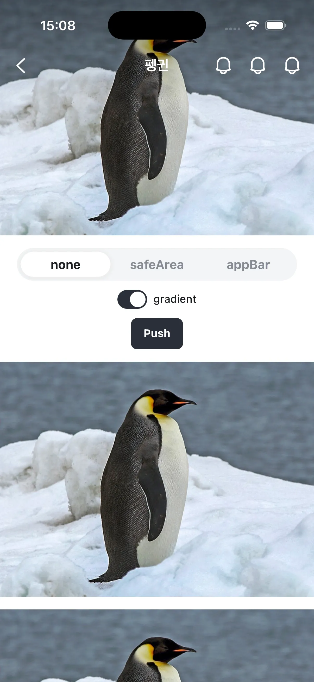
AppBar의 배경이 투명해집니다.- 모바일 OS 상태바를 포함한
AppScreen상단에 그라디언트가 표시됩니다.gradient속성을false로 설정하여 숨길 수 있습니다.
import { IconBellFill } from "@karrotmarket/react-monochrome-icon";
import { Flex } from "@seed-design/react";
import type { StaticActivityComponentType } from "@stackflow/react/future";
import {
  AppBar,
  AppBarCloseButton,
  AppBarIconButton,
  AppBarLeft,
  AppBarMain,
  AppBarRight,
} from "seed-design/ui/app-bar";
import { AppScreen, AppScreenContent } from "seed-design/ui/app-screen";

declare module "@stackflow/config" {
  interface Register {
    ActivityAppScreenTransparent: {};
  }
}

const ActivityAppScreenTransparent: StaticActivityComponentType<
  "ActivityAppScreenTransparent"
> = () => {
  return (
    <AppScreen theme="cupertino" layerOffsetTop="none" tone="transparent">
      <AppBar>
        <AppBarLeft>
          <AppBarCloseButton aria-label="Close" />
        </AppBarLeft>
        <AppBarMain>Preview</AppBarMain>
        <AppBarRight>
          <AppBarIconButton aria-label="Notification">
            <IconBellFill />
          </AppBarIconButton>
        </AppBarRight>
      </AppBar>
      <AppScreenContent>
        <Flex
          height="full"
          justify="center"
          align="center"
          bg="palette.gray800"
          color="fg.neutralInverted"
        >
          Preview
        </Flex>
      </AppScreenContent>
    </AppScreen>
  );
};

export default ActivityAppScreenTransparent;
With Intersection Observer
Intersection Observer를 사용해 AppBar의 tone 속성을 동적으로 변경할 수 있습니다.
import { IconBellFill } from "@karrotmarket/react-monochrome-icon";
import { Flex } from "@seed-design/react";
import type { StaticActivityComponentType } from "@stackflow/react/future";
import { useEffect, useRef, useState } from "react";
import {
  AppBar,
  AppBarCloseButton,
  AppBarIconButton,
  AppBarLeft,
  AppBarMain,
  type AppBarProps,
  AppBarRight,
} from "seed-design/ui/app-bar";
import { AppScreen, AppScreenContent } from "seed-design/ui/app-screen";

declare module "@stackflow/config" {
  interface Register {
    ActivityAppScreenIntersectionObserver: {};
  }
}

const ActivityAppScreenIntersectionObserver: StaticActivityComponentType<
  "ActivityAppScreenIntersectionObserver"
> = () => {
  const [tone, setTone] = useState<AppBarProps["tone"]>("transparent");
  const whiteImageRef = useRef<HTMLDivElement>(null);

  useEffect(() => {
    const observer = new IntersectionObserver(
      (entries) => {
        const entry = entries[0];

        if (!entry.isIntersecting) {
          // 이미지 영역을 벗어나면 tone을 layer로 변경
          setTone("layer");
        } else {
          // 이미지 영역을 포함하면 tone을 transparent로 변경
          setTone("transparent");
        }
      },
      {
        threshold: [0, 0.1, 0.5, 1],
        rootMargin: "0px",
      },
    );

    if (whiteImageRef.current) {
      observer.observe(whiteImageRef.current);
    }

    return () => {
      observer.disconnect();
    };
  }, []);

  return (
    <AppScreen theme="cupertino" layerOffsetTop="none" tone={tone}>
      <AppBar>
        <AppBarLeft>
          <AppBarCloseButton aria-label="Close" />
        </AppBarLeft>
        <AppBarMain>Preview</AppBarMain>
        <AppBarRight>
          <AppBarIconButton aria-label="Notification">
            <IconBellFill />
          </AppBarIconButton>
        </AppBarRight>
      </AppBar>
      <AppScreenContent>
        <Flex
          ref={whiteImageRef}
          justifyContent="center"
          alignItems="center"
          bg="palette.staticWhite"
          height="400px"
          width="full"
        >
          하얀 이미지
        </Flex>
        <Flex
          height="1000px"
          justify="center"
          align="center"
          bg="palette.gray800"
          color="fg.neutralInverted"
        >
          컨텐츠 영역
        </Flex>
      </AppScreenContent>
    </AppScreen>
  );
};

export default ActivityAppScreenIntersectionObserver;
Layer Offset Top
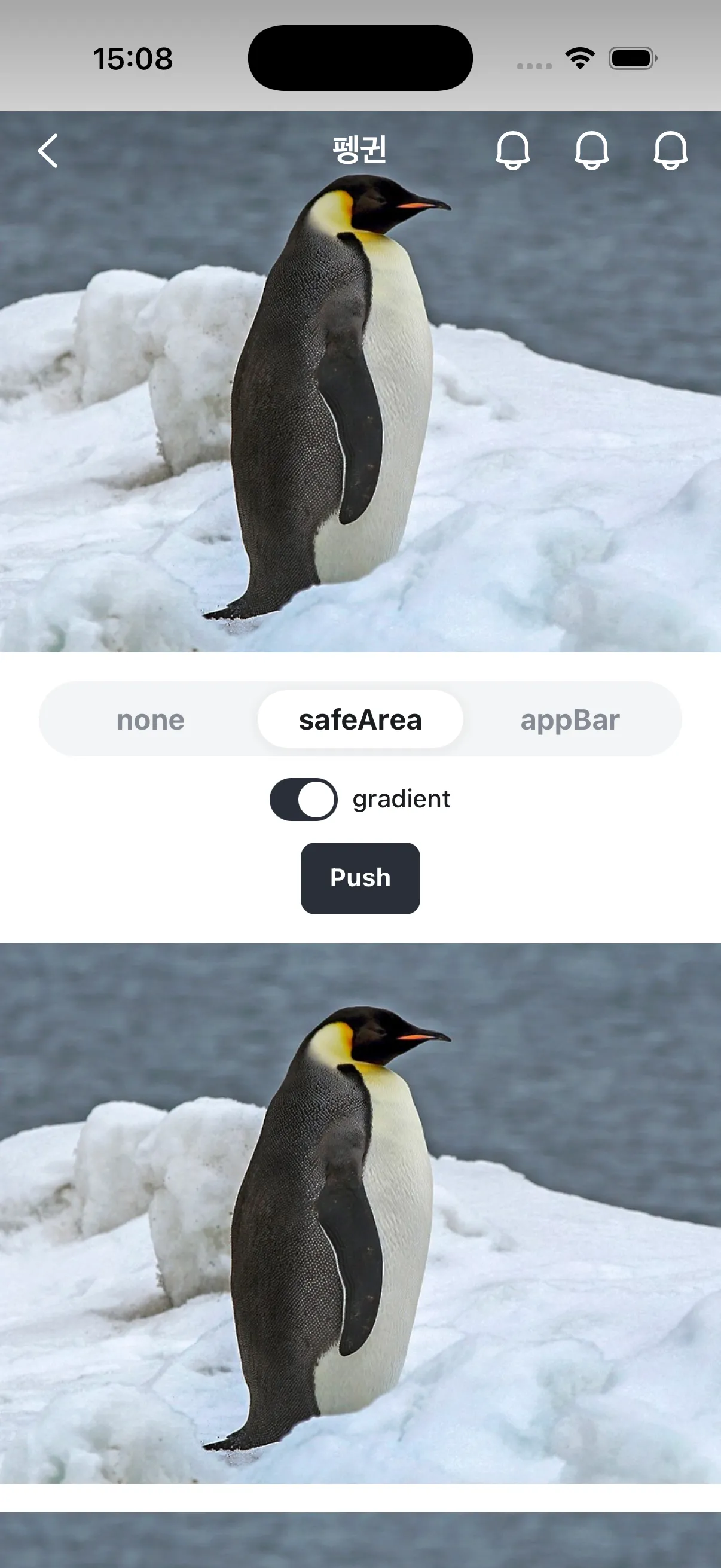
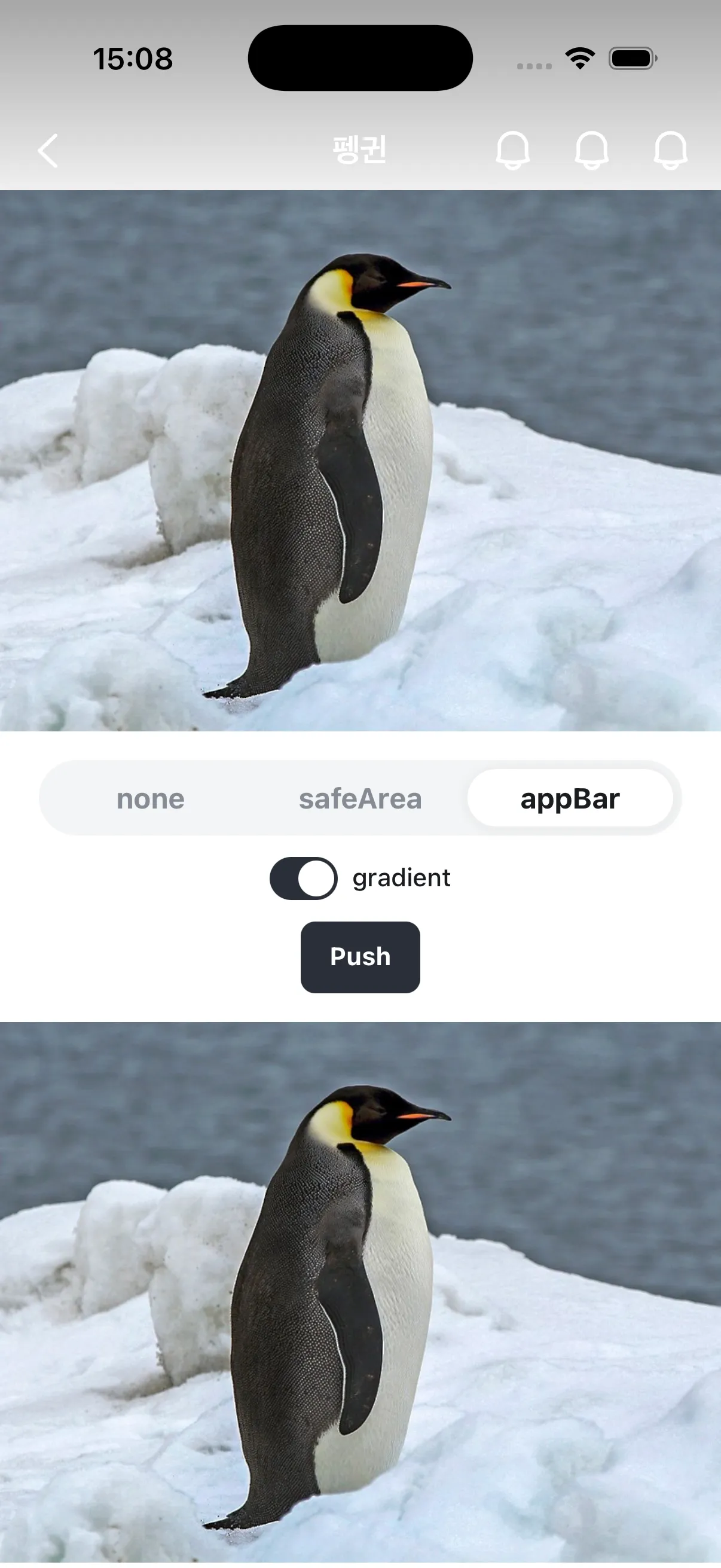
layerOffsetTop 속성을 사용해 AppScreenContent의 상단 오프셋을 조정할 수 있습니다.
tone="transparent"와 gradient를 사용하는 경우, 일반적으로 layerOffsetTop="none"을 함께 설정하여 모바일 OS 상태바 영역까지 콘텐츠 영역을 확장합니다.
디스플레이 컷아웃 (notch) 등 safe area를 올바르게 처리하기 위해 viewport-fit=cover가 포함된 viewport 메타 태그를 사용하세요.
<meta
  name="viewport"
  content="width=device-width, initial-scale=1, viewport-fit=cover"
/>
Customizing App Bar
tone="layer"인 경우 AppBar의 색상을 변경할 수 있습니다.
AppBarIconButton 내에 Icon 컴포넌트를 사용하여 아이콘을 커스터마이징할 수 있습니다.
Icon
아이콘 컴포넌트에 대해 자세히 알아봅니다.
import { Flex, Icon } from "@seed-design/react";
import { IconBellFill } from "@karrotmarket/react-monochrome-icon";
import type { StaticActivityComponentType } from "@stackflow/react/future";
import { AppBar, AppBarIconButton, AppBarMain, AppBarRight } from "seed-design/ui/app-bar";
import { AppScreen, AppScreenContent } from "seed-design/ui/app-screen";

declare module "@stackflow/config" {
  interface Register {
    ActivityAppScreenAppBarCustomization: {};
  }
}

const ActivityAppScreenAppBarCustomization: StaticActivityComponentType<
  "ActivityAppScreenAppBarCustomization"
> = () => {
  return (
    <AppScreen theme="android">
      <AppBar bg="palette.blue200">
        <AppBarMain title="Preview" subtitle="This is a nice preview." />
        <AppBarRight>
          <AppBarIconButton aria-label="Notification">
            <Icon svg={<IconBellFill />} color="palette.blue500" size="x5" />
          </AppBarIconButton>
        </AppBarRight>
      </AppBar>
      <AppScreenContent>
        <Flex justify="center" align="center" height="full">
          Preview
        </Flex>
      </AppScreenContent>
    </AppScreen>
  );
};

export default ActivityAppScreenAppBarCustomization;
Custom Elements in App Bar
AppBar 내에 AppBarLeft, AppBarMain, AppBarRight에 대응되지 않는 커스텀 요소를 배치하는 경우, 다른 요소와 동일한 화면 전환 트랜지션을 적용하기 위해 AppBarSlot 컴포넌트를 사용합니다.
AppBarSlot은 하위 요소에 class를 주입하여 트랜지션을 적용하며, 추가 마크업은 생성하지 않습니다.
import { useActivity, useFlow, type StaticActivityComponentType } from "@stackflow/react/future";
import {
  AppBar,
  AppBarBackButton,
  AppBarLeft,
  AppBarRight,
  AppBarIconButton,
  AppBarSlot,
} from "seed-design/ui/app-bar";
import { AppScreen, AppScreenContent } from "seed-design/ui/app-screen";
import { IconBellLine } from "@karrotmarket/react-monochrome-icon";
import { Flex, Text, VStack } from "@seed-design/react";
import { ActionButton } from "seed-design/ui/action-button";

declare module "@stackflow/config" {
  interface Register {
    ActivityAppBarSlot: Record<string, never>;
  }
}

function FakeSearchBar(props: React.HTMLAttributes<HTMLDivElement>) {
  return (
    <Flex grow py="x2" px="x2_5" height="full" style={{ boxSizing: "border-box" }} {...props}>
      <Flex
        px="x3"
        background="bg.neutralWeak"
        grow
        borderRadius="r2"
        align="center"
        borderColor="stroke.neutralMuted"
        borderWidth={1}
      >
        <Text color="fg.placeholder" textStyle="t4Medium">
          검색어를 입력하세요
        </Text>
      </Flex>
    </Flex>
  );
}

const ActivityAppBarSlot: StaticActivityComponentType<"ActivityAppBarSlot"> = () => {
  const { isRoot } = useActivity();
  const { push } = useFlow();

  return (
    <AppScreen theme="cupertino">
      <AppBar>
        {!isRoot && (
          <AppBarLeft>
            <AppBarBackButton />
          </AppBarLeft>
        )}

        <AppBarSlot>
          <FakeSearchBar />
        </AppBarSlot>

        <AppBarRight>
          <AppBarIconButton aria-label="알림">
            <IconBellLine />
          </AppBarIconButton>
          <AppBarIconButton aria-label="알림">
            <IconBellLine />
          </AppBarIconButton>
        </AppBarRight>
      </AppBar>
      <AppScreenContent>
        <VStack gap="spacingY.componentDefault" px="spacingX.globalGutter" py="x4">
          <Text as="p" textStyle="articleBody" color="fg.neutral">
            AppBar.Slot은 커스텀 요소에 stackflow 트랜지션 애니메이션을 적용합니다. 이 페이지에서
            뒤로 swipe하면 검색바가 IconButton과 동일하게 fade 트랜지션됩니다.
          </Text>
          <ActionButton onClick={() => push("ActivityAppBarSlot", {})} variant="neutralSolid">
            이 액티비티 다시 열기
          </ActionButton>
        </VStack>
      </AppScreenContent>
    </AppScreen>
  );
};

export default ActivityAppBarSlot;
Preventing Swipe Back
preventSwipeBack 속성을 사용해 theme="cupertino"인 AppScreen에서 edge 영역을 렌더링하지 않음으로써 스와이프 백 제스처를 방지할 수 있습니다.
Transition Styles
transitionStyle 속성을 사용해 AppScreen이 최상위로 push되거나 최상위에서 pop될 때 재생할 트랜지션을 지정할 수 있습니다.
최상위: useActivity().isTop === true인 액티비티로 만들어진 AppScreen을
의미합니다.
별도로 지정하지 않는 경우, transitionStyle은 theme에 따른 기본값을 갖습니다.
theme="cupertino":slideFromRightIOStheme="android":fadeFromBottomAndroid
최상위 AppScreen이 push/pop될 때, 최상위가 아닌 AppScreen도 함께 트랜지션을 재생합니다.
최상위가 아닌 AppScreen의 트랜지션 스타일
@seed-design/[email protected]까지
최상위 AppScreen이 push/pop될 때, 최상위가 아닌 AppScreen은 각 AppScreen의 고유한 transitionStyle을 재생합니다.
- 예를 들면,
transitionStyle="fadeFromBottomAndroid"인 0번 AppScreen 위에transitionStyle="slideFromLeftIOS"인 1번 AppScreen이 push되는 경우, 0번 AppScreen은fadeFromBottomAndroid트랜지션을 재생합니다.- 0번 AppScreen이 위치 변화 없이 그대로 유지된 상태에서(
fadeFromBottomAndroid) 1번 AppScreen이 우측에서 슬라이드 인(slideFromLeftIOS)
- 0번 AppScreen이 위치 변화 없이 그대로 유지된 상태에서(
이후 버전
최상위 AppScreen이 push/pop될 때, 최상위가 아닌 AppScreen은 최상위 AppScreen의 transitionStyle을 재생합니다.
- 같은 스택 내에 여러
transitionStyle이 공존할 때 자연스러운 트랜지션을 제공합니다. - 예를 들면,
transitionStyle="fadeFromBottomAndroid"인 0번 AppScreen 위에transitionStyle="slideFromLeftIOS"인 1번 AppScreen이 push되는 경우, 0번 AppScreen은slideFromLeftIOS트랜지션을 재생합니다.- 0번 AppScreen이 자연스럽게 좌측으로 조금 밀려나며 어두워지고(
slideFromLeftIOS) 1번 AppScreen이 우측에서 슬라이드 인(slideFromLeftIOS)
- 0번 AppScreen이 자연스럽게 좌측으로 조금 밀려나며 어두워지고(
import { VStack, Text } from "@seed-design/react";
import { useFlow, type StaticActivityComponentType } from "@stackflow/react/future";
import {
  AppBar,
  AppBarBackButton,
  AppBarIconButton,
  AppBarLeft,
  AppBarMain,
  AppBarRight,
} from "seed-design/ui/app-bar";
import { AppScreen, AppScreenContent, type AppScreenProps } from "seed-design/ui/app-screen";
import { IconHouseLine } from "@karrotmarket/react-monochrome-icon";
import { ActionButton } from "seed-design/ui/action-button";
import { appScreenVariantMap } from "@seed-design/css/recipes/app-screen";
import { Snackbar, useSnackbarAdapter } from "seed-design/ui/snackbar";
import { SegmentedControl, SegmentedControlItem } from "seed-design/ui/segmented-control";
import { useState } from "react";

declare module "@stackflow/config" {
  interface Register {
    ActivityTransitionStyle: {
      transitionStyle: NonNullable<AppScreenProps["transitionStyle"]>;
    };
  }
}

const ActivityTransitionStyle: StaticActivityComponentType<"ActivityTransitionStyle"> = ({
  params: { transitionStyle },
}) => {
  const { push } = useFlow();
  const { create } = useSnackbarAdapter();
  const [preventSwipeBack, setPreventSwipeBack] = useState(false);

  return (
    <AppScreen
      transitionStyle={transitionStyle}
      preventSwipeBack={preventSwipeBack}
      onSwipeBackStart={() => {
        create({ render: () => <Snackbar message="Started swiping" />, timeout: 500 });
      }}
      onSwipeBackEnd={({ swiped }) => {
        create({ render: () => <Snackbar message={`Swiped: ${swiped}`} />, timeout: 500 });
      }}
    >
      <AppBar>
        <AppBarLeft>
          <AppBarBackButton />
        </AppBarLeft>
        {/* can be undefined if search parameter isn't provided */}
        <AppBarMain title={transitionStyle ?? "Transition Styles"} />
        <AppBarRight>
          <AppBarIconButton aria-label="Home" onClick={() => push("ActivityHome", {})}>
            <IconHouseLine />
          </AppBarIconButton>
        </AppBarRight>
      </AppBar>
      <AppScreenContent>
        <VStack px="spacingX.globalGutter" py="x3" gap="x4">
          <VStack gap="x2">
            {appScreenVariantMap.transitionStyle.map((style) => (
              <ActionButton
                key={style}
                variant={transitionStyle === style ? "neutralWeak" : "neutralSolid"}
                onClick={() => push("ActivityTransitionStyle", { transitionStyle: style })}
              >
                {style}
              </ActionButton>
            ))}
          </VStack>
          <VStack gap="x2" align="center">
            <Text textStyle="t3Bold" aria-hidden>
              Prevent Swipe Back
            </Text>
            <SegmentedControl
              value={preventSwipeBack ? "true" : "false"}
              onValueChange={(value) => setPreventSwipeBack(value === "true")}
              aria-label="Prevent Swipe Back"
            >
              <SegmentedControlItem value="false">false</SegmentedControlItem>
              <SegmentedControlItem value="true">true</SegmentedControlItem>
            </SegmentedControl>
          </VStack>
        </VStack>
      </AppScreenContent>
    </AppScreen>
  );
};

export default ActivityTransitionStyle;
Last updated on